ICE: Incident Clustering Explorer

A novel, web-based, visual analytics tool called the Incident Cluster Explorer (ICE) was developed as an application that affords sophisticated yet user-friendly analysis of transportation incident datasets. Interactive maps, histograms, two-dimensional plots and parallel coordinates plots are four featured visualizations that were integrated together into ICE to allow users to interact with and see relationships between multiple visualizations. With a rich set of filters, users can create custom conditions to filter data and focus on a smaller dataset. Normal identification of interesting relationships and outliers in multivariate datasets can be time-consuming; however ICE adopts a rank-by-feature framework to quantify the strength of relationships between the different data fields.
In the screenshots below, incident data collected by the Maryland State Highway Administration’s CHART program is used; however, the tool can be easily modified to accept other transportation datasets.

Figure 1: The ICE Dashboard with map, graphing window, and data selection/filtering window.
CE follows the general design guidelines “overview first, zoom and filter, then details-on-demand.” The screen space is distributed into three sections as seen in FIGURE 1. On the left is the control panel, which contains filter and ranking panels. The filter panel contains a rich set of filters that allows users to narrow down the dataset. The ranking panel adopts the idea of rank-by-feature framework, allowing users to rank the variables or relationships between variables by various criteria. The main area on the right is horizontally divided into two resizable sections. By default, the top-right section is dedicated to the map, featuring two displaying modes. Users can select between icon mode, plotting every incident as a circle on the map, or heat mode, using the heat map algorithm to draw color regions on the map. The bottom-right section locates a traditional tabular view of data and three visualization components: histogram, two-dimensional (2D) plot, and parallel coordinates plot.
The histogram shows distributions of the dataset for a selected variable. The 2D plot visualizes relationships between a selected pair of variables in scatter plot mode and grid mode. The parallel coordinates plot provides an overview of distributions and relationships of multiple variables. To provide flexibility, users can also drag and drop to move components between the top-right and bottom-right section.

Figure 2: Selecting data from the histogram highlights it on the map.
A significant feature of ICE is that all of these seemingly individual components are tied together. Filtering the dataset using the left side of the screen will immediately affect all other components. Selecting a particular incident or set of incidents in one component will also highlight identical selections in other components. FIGURE 2 shows how while viewing a histogram, one can select a cluster of points on the map which immediately highlights those data points on the histogram. Similarly, clicking on an area of the histogram highlights those corresponding data points on the map.

Figure 3: 2D histograms can be interactive.

Figure 4: Histograms can be transformed into bubble charts..

Figure 5: Histograms can be transformed into heat maps.
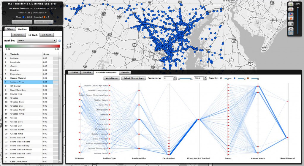
Figure 6: Parallel Coordinates Plots are used to show important linkages between multivariate data sets.

Figure 7: Specific incident details can be viewed, and incident timelines can be created.

Figure 8: Statistical functions can be run on the datasets to search for Standard Deviation of Frequencies, Outliers, Uniformity of the Distribution, etc.

Figure 9: Even 2D ranking and statistical functions can be computed including Correlation of Coefficients.

Figure 10: Parallel Coordinates Plots are interactive and can be further filtered and analyzed.

Figure 11: Heatmap settings are fully customizable down to color scales and gradients.