Arc Chart
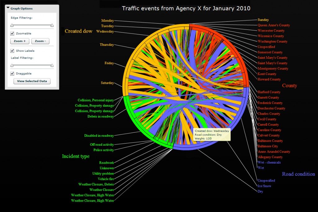
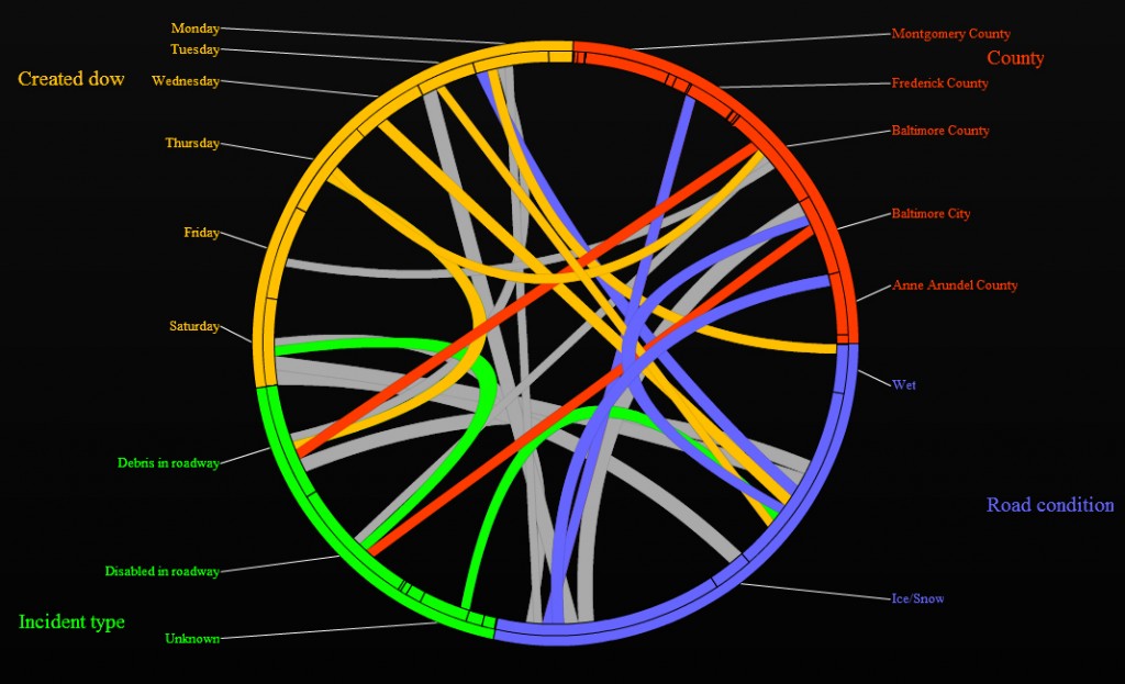
When dealing with data sets containing hundreds of variables, it is often extremely difficult, if not impossible, to quickly discover important and significant relationships that exist among the various data points. The Arc Chart, an interactive, web-based circular dependency graph, was developed to give analysts the ability to visually identify these dependencies and links between any categorical, temporal, or spatial variables in a given data set. The figures below highlight some of the features found in the Arc Chart.
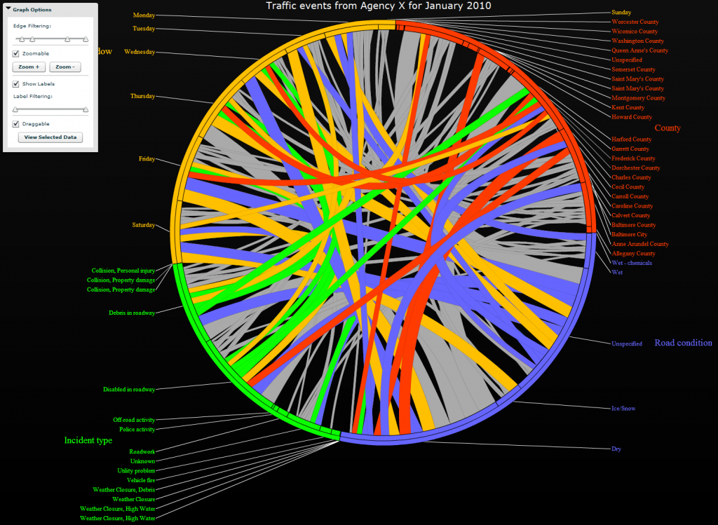
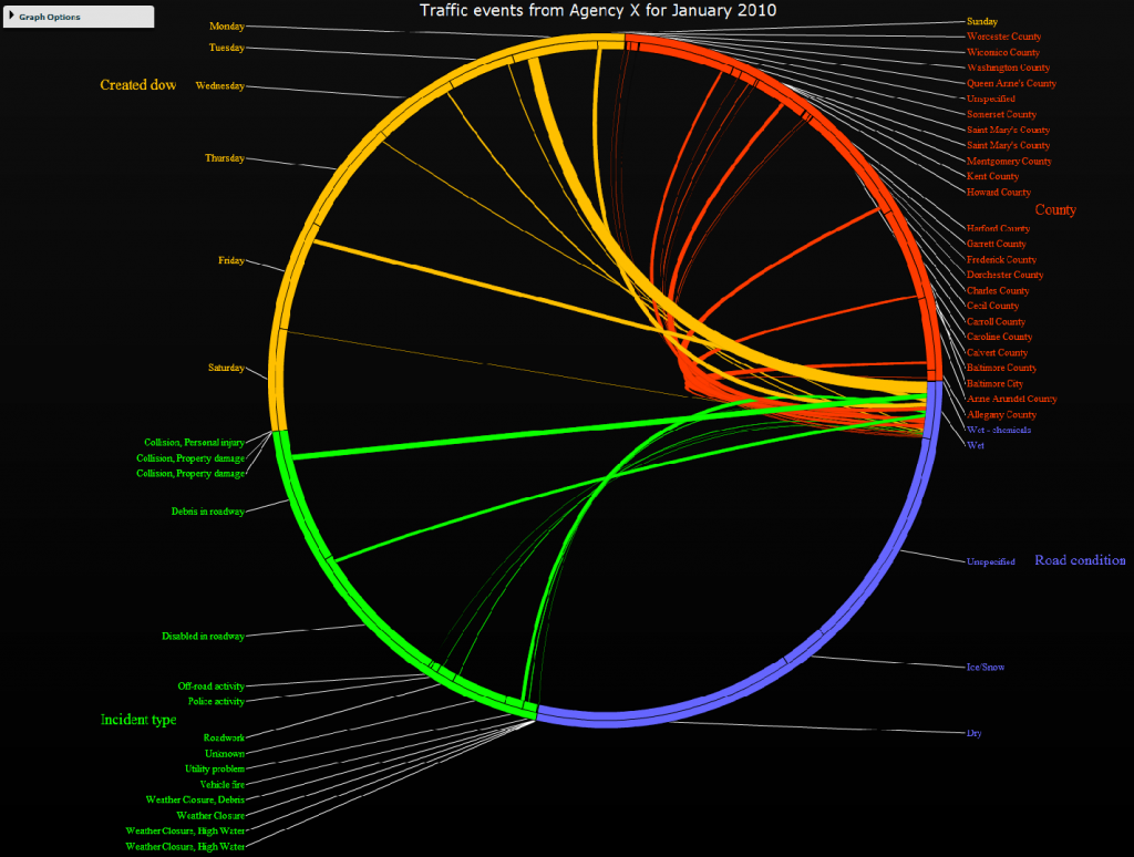
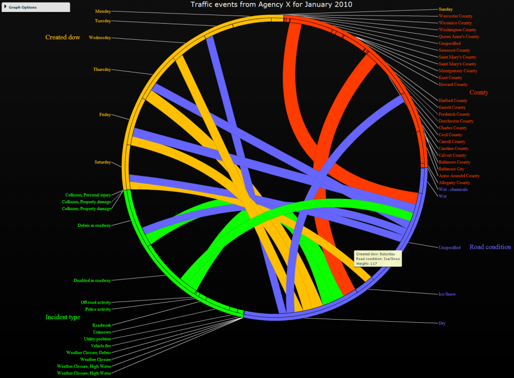
Here, only the largest correlations are shown. The tooltip indicates what two variables a correlation connects to, as well as the weight of the correlation.
