Clarus History Explorer

The CATT Lab has integrated all Clarus Data into their Regional Integrated Transportation Information System (RITIS) for real-time situational awareness and historical safety data analysis. RITIS is a data fusion engine that ingests transportation data in real-time. The data is stored in its native format for agency-specific performance reporting, but it is translated and fused into a standard format for enabling regional analysis and visualization.
The initial outcomes of this project are the full integration of RITIS and Clarus datasets into a massive database, the creation of a series of real-time situational awareness tools built around the integrated data sources, and the creation of several visual analytics tools that allow users to explore the relationships between weather, speed, volume, and incident datasets.
The incorporation of Clarus data into the RITIS platform means that there are now thousands of transportation operations specialists, university researchers, and metropolitan planning agencies that have the ability to view real-time road weather data within the broader context of other transportation system information. Researchers are also developing visual analytics tools surrounding these combined data sets that will enable new forms of data analysis and discovery.
Real-time Situational Awareness
Nationwide (and Canadian) Road Weather Information System (RWIS) data is now available on our production RITIS servers. The following images show how the data is represented. To meet the needs of different types of users, we are giving the individuals multiple ways to view the data.
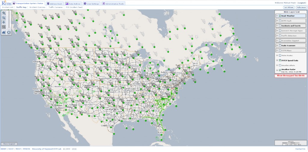
Figure 1: Nationwide view of Clarus RWIS stations.
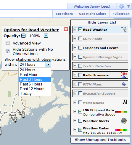
Figure 2: Adjusting user settings to control which stations are shown.
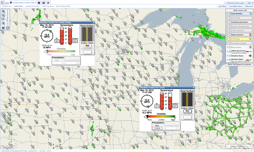
Figure 3: Clicking on a weather station brings up a graphical view of surface weather conditions.
In the above view, the data is represented in a simplistic graphical form. When roads are icy, a picture of the road becomes icy. When roads are wet, a picture of the road becomes wet. Dangerous conditions are indicated by highlighted and flashing animations. Visibility meters indicate relative visibility distance. These layers can be turned on and off. Note that not every variable is displayed (like barometric pressure). Only elements deemed most critical to the everyday user is presented.
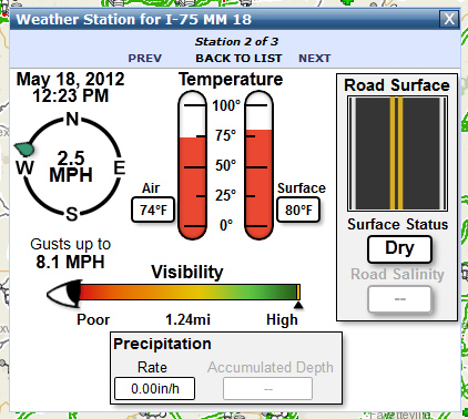
Figure 4: Close up view of RWIS data popups.
In the Advanced View, the data is presented to the user in the same manner that it is presented within the Clarus system; however, we have changed the representation of the variable names so that they are more easily readable. As within the Clarus system, the RWIS layer can be turned on and off by the user within the RITIS map.
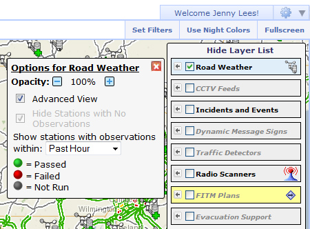
Figure 5: Switching to the “Advanced View” to see more details.
In the Advanced View, the data is presented to the user in the same manner that it is presented within the Clarus system; however, we have changed the representation of the variable names so that they are more easily readable. As within the Clarus system, the RWIS layer can be turned on and off by the user within the RITIS map.
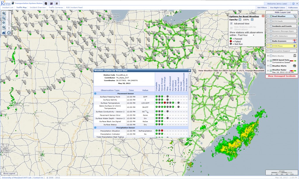
Figure 6: Screenshot of the advanced data view popup window
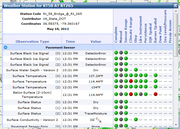
Figure 7: The Advanced View shows specific measurements and the results of quality assurance tests.
The colored balls within the advanced data view table let the user know what types of quality checks have been performed on the data, and whether or not the measurements have passed or failed.
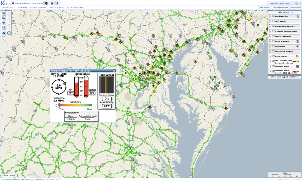
Figure 8: Clarus data merged with incident and traffic data.

Figure 9: Clarus data merged with NWS Radar data.
Alert Mode
Most users do not want to view all of the individual weather station icons on the map at the same time. This creates clutter and can hide other more important data elements. Furthermore, it is not easy for operators to have to “hunt” for weather related problems on the road. To combat this issue, the RITIS design team has created custom alerts for weather stations. Users can define thresholds on specific subsets of station data that should trigger alarms.
In the image below, several weather alerts are being generated from sensors. These alerts can include things like low visibility warnings, icy conditions, and high wind advisories. This functionality means that operators can focus their attention on other critical map elements and only react to weather events when their specified thresholds are met.
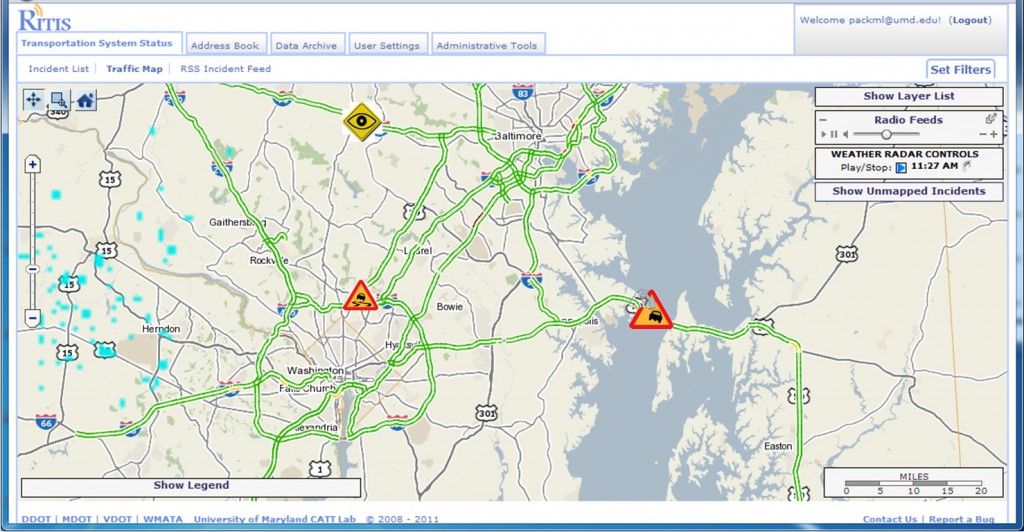
Figure 10: User defined alerts help to unclutter the map.
Historical Analysis
As new Clarus data is published through the Clarus data feeds, the CATT Laboratory development team is archiving all of it indefinitely for use in other research projects. The CATT Lab has developed a basic historical Clarus data explorer that attempts to show the relationship between various weather measurements, traffic speeds, traffic volumes, and incidents. The system is quite easy to use and is web based.
The user is first presented with a map of all RWIS stations as seen in the graphic below. The user can then choose a weather station to explore.
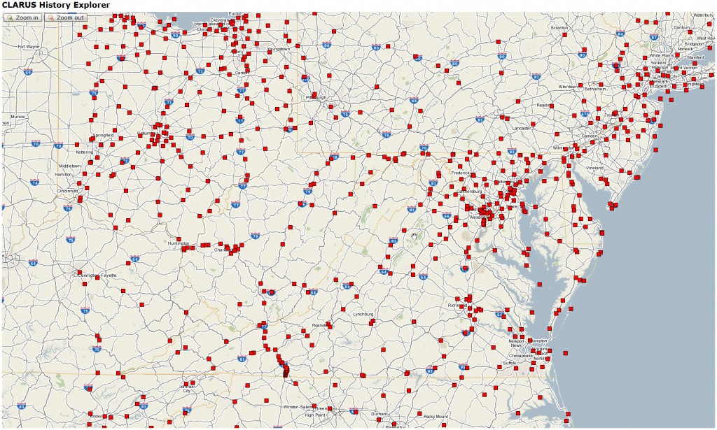
Figure 11: Clarus Historical RWIS station selection map.
Once a weather station has been selected, the user is presented with a strip-chart style timeline of weather, traffic, and incident data with a corresponding map insert and a data selection window. The user can use a series of slider bars at the top of the screen to zoom in on a specific period of time anywhere from an hour long to several weeks long.
As the date ranges are selected, the map updates to show where incidents occurred in the vicinity of the RWIS station. Similarly, the strip charts are updated to show when the incidents occurred through time.
The user can then select which data elements should be overlaid onto the time series charts. This allows the user to see, for example, the relationship between heavy rain affecting visibility, traffic speeds dropping, congestion increasing, air temperatures dropping, etc. Each layer can be independently turned on or off, and clicking on portions of the charts and graphs provide details about the data elements, highlight key functions, etc.
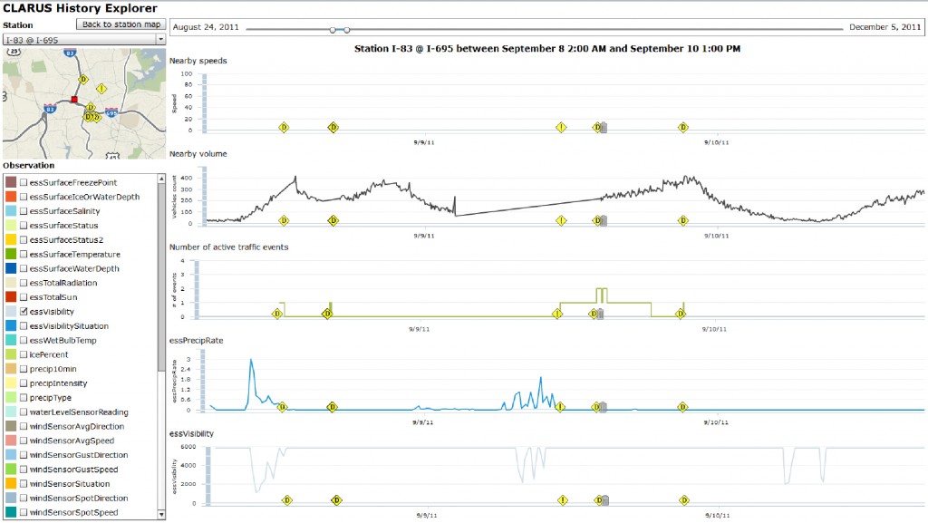
Figure 12: Relationships between speed, volume, visibility, precipitation, and incidents can be viewed on a temporal strip chart.
