Time Spiral

Temporal data sets often present an interesting characteristic of being linear in nature, but contain cyclic patterns that are not effectively conveyed by conventional linear visualizations and are often more interesting than the linearity of the data itself. The Time Spiral, an interactive web-based tool, employs a visualization technique that allows these cyclic patterns to take center stage, while at the same time simplifies the identification of breaks or anomalies in the data set being investigated. To achieve this, the Time Spiral renders data along a temporal axis which spirals outward at regular intervals. Individual data points are rendered as bands along the axis, creating visual clusters among datum that contribute to patterns.
The Time Spiral can be used to allow analysts to view multiple temporal data sets together using the techniques described above. The figures below highlight some of the advantages to using the Time Spiral when viewing temporal data sets.

All incidents recorded in VDOTIM from March 2005 to November 2008, plotted on a Spiral Graph with a cycle size of one week.

Number of delayed flights at O'Hare International Airport during September 2001

Duration of flight delays at O’Hare International Airport during September 2001. Flights colored in red were diverted.
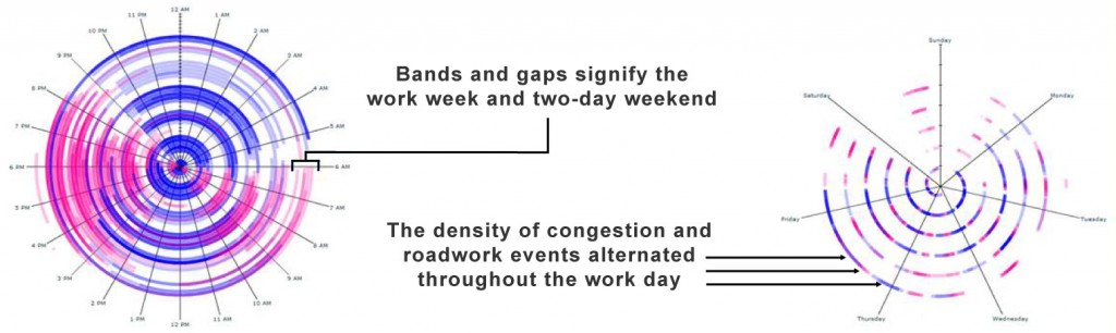
Congestion (pink) and roadwork (blue) in Virginia for two months

The status of a traffic detector (up-time in green, down-time in red) for one year.

The spiral method effectively shows the continuation of time as you move outward, while the ring method makes the different layers seem disconnected.

